Facilitated divergence, collaborative convergence: How the Bolster visual identity workshop works.
Our foundational visual identity workshop is an exercise in creativity, honed through years of practice and refinement. This article outlines the workshops' five part structure.
By
Henry Alcock-White
The search for meaning in 5 parts
The workshop is exploration that is both intentional and playful. We begin every project here, exploring everything from finite details to broad expansive ideas. It engages and aligns all participants. It's core objective is to us unearth meaningful ideas and concepts worth developing while avoiding those that won't resonate (or worse, ring hollow).
Concepts are the spark, the foundation from which all our best work originates, a source of ideas and inspiration to draw upon. The workshop aims to tease out potential concepts through a series of facilitated exercises. These exercises take us on a journey that is begins divergent and broad, then leads to a place that convergent, focussed, and inspired.
It follows five parts, the last being a coming together of the ideas explored:
Orientation
Words
Symbology
Mood
Convergence
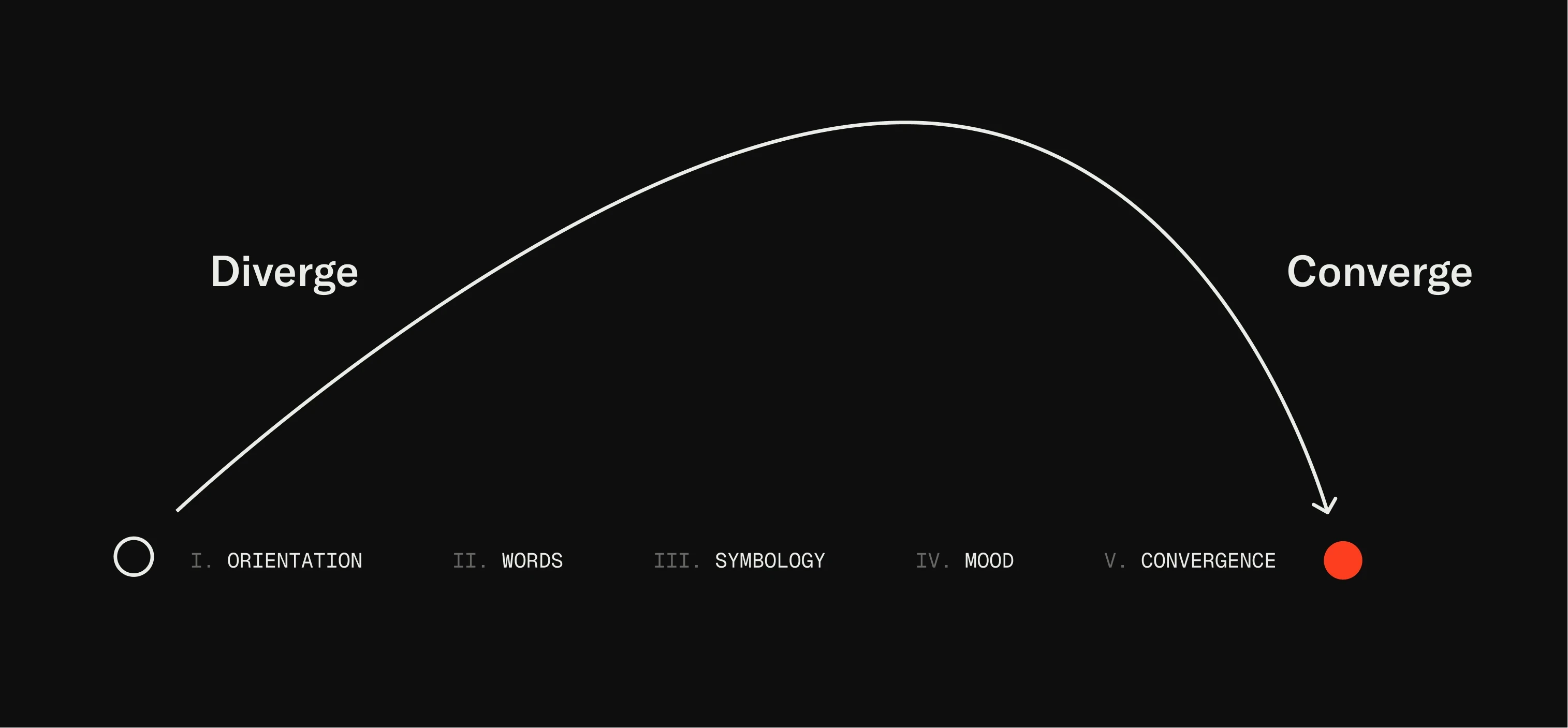
The convergence arc
i. Orientation
Before we get into it we pause, review, and take stock of where we are, what we're working on, where we're headed. Existing brand assets, competitors and other relevant references or found materials will be be looked at and discussed. Questions will asked. Curiosity will be evoked.
ii. Words
Divergence begins in ernest in part 2. It begins with a considered and analytical look at the name. Literally the combination of letters that come together to form the word(s) that spell out the name of the brand.
What is the meaning behind the name? What is the intention of the word(s) and how they relate to the brand itself? How do we want viewers to read, understand, and feel when they encounter it? Are there multiple definitions for this word?
We then turn to the visual representation of the name: letters. The letters that come together to create a name are arranged and orientated on the page in as many as we can think of. You're probably thinking, how many ways can there be? Well, actually, a lot.
Color, opacity, font weight, casing, etc. are considered. Different letters and words have different feelings and compositions. Some arrangements may read odd. Emphasis might need to be suggested or implied.
Next we bring typography into the mix. A selection of fonts are applied to the letters. Does anything jumps out? Any sparks? And how does this alter previous thoughts or notions? Sometimes backtracking happens, other times it affirms previous conclusions. Often it reveals new avenues.
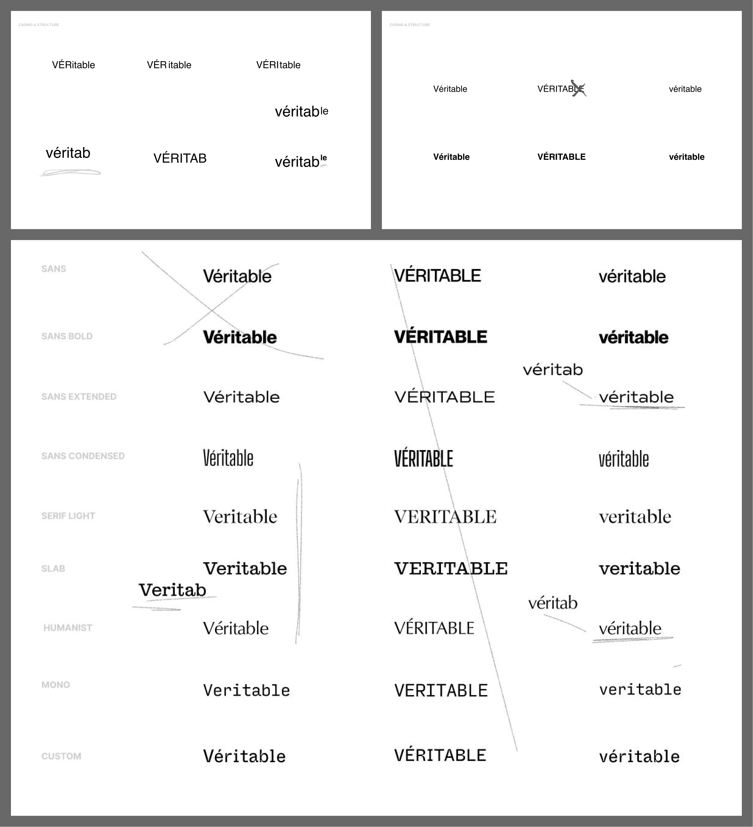
An expert from a workshop for a brand based in a French-speaking part of the world but also doing work in anglophone markets. The name was challenging because of the likelihood of English speakers to mispronunce. The workshop led to an entirely new spelling of the brands name.
iii. Symbology
In part three we consider what, if any, symbol might use to represent the brand.
We explore different hypothetical symbols by breaking them down into a few broad categories. Is it a letter-form? illustrative? purely abstract? or some combination? Or is there even a symbol at all? If there is, what might work to represent the brand? An object? If it's abstract shape that evokes a certain feeling or impression?
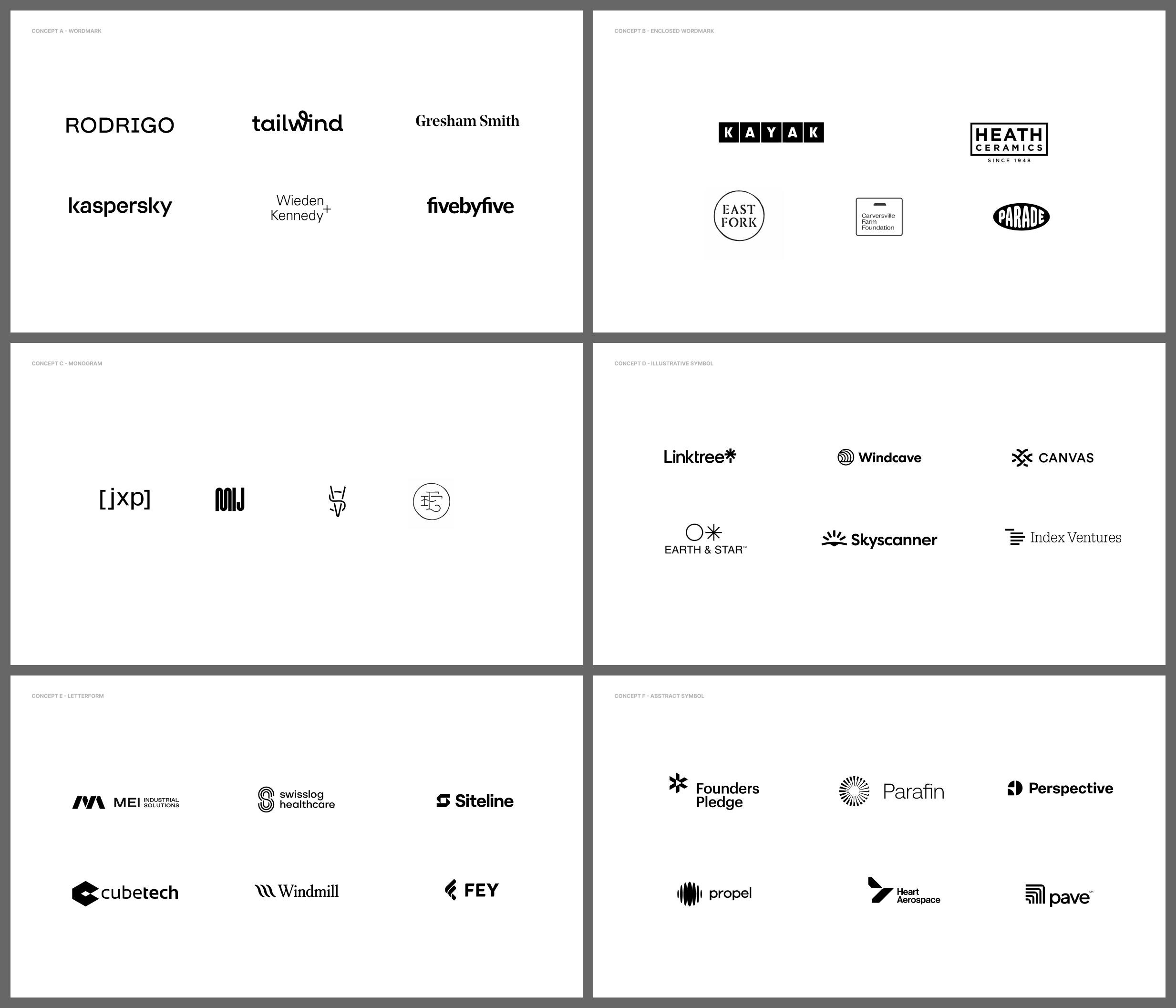
A selection of categorized symbols, for contemplation
iv. Mood
In design, everyone uses moodboards a bit differently. We use them expansively: Take the name moodboard and break it down: a series of "boards", each one expressing a different "mood". A vibe, impression, presence, aesthetic, what have you.
There is a temptation to focus or pull elements out of the boards, a color, font, treatment, This is fine, we don't want to limit this. But the belief we hold is that this tendency is almost a diagnosis. "this one feels premium because of this font".
We urge participants to take a step back. Squint a little. Put yourself in the shoes of your customer for a moment. What do you want them to feel ? What is the mood and impression we want to create? Which of these "boards" come closest to that?
Once identified we can then's discuss what some ways to accomplish the creation of particular impressions.
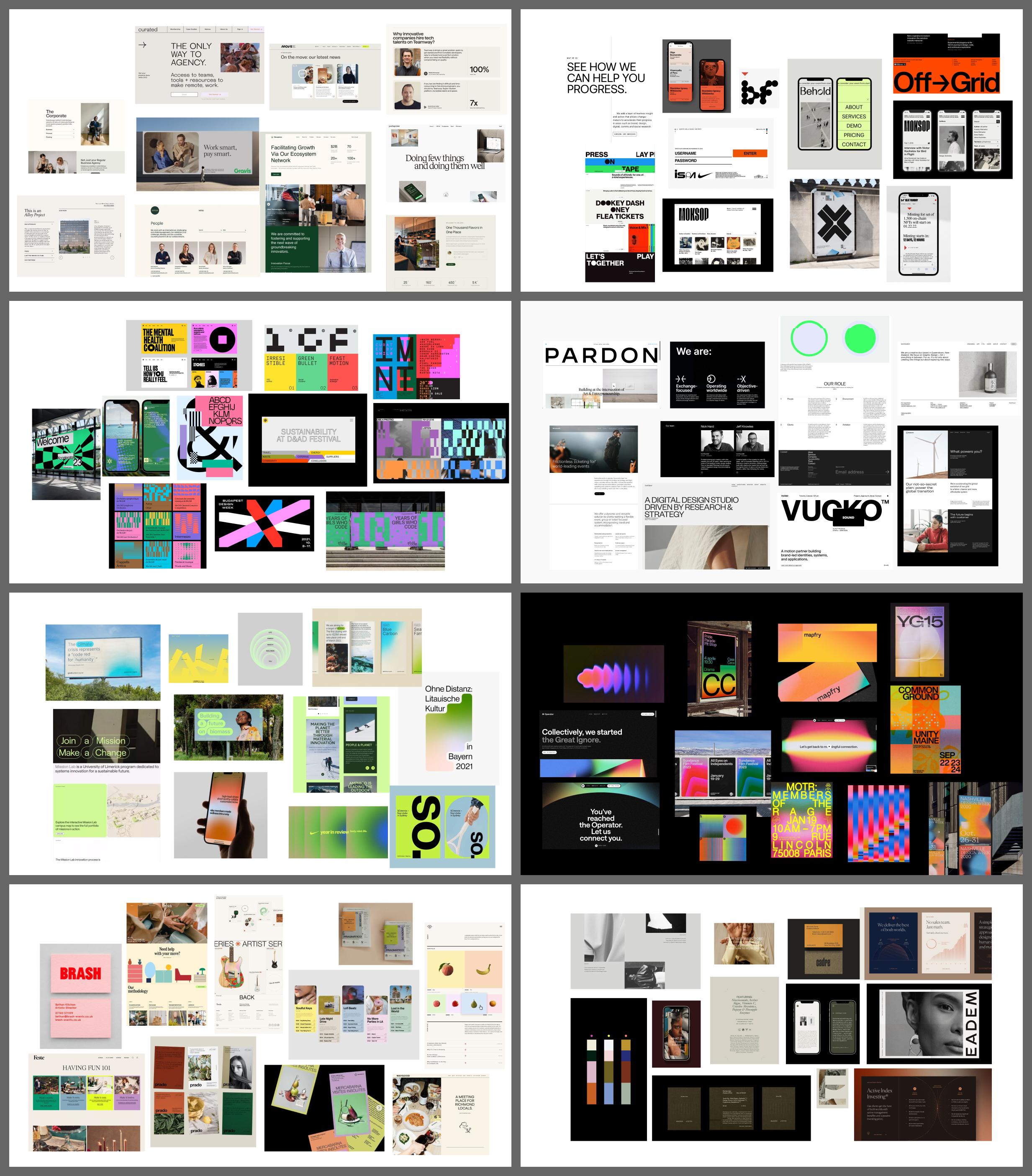
What's our presence? A selection of moodboards, organized and assembled to demonstrate particular vibes and feelings through visual language.
v. Convergence
Ideas have been sparked, teased out, and exposed. In the final convergent phase of the workshop we collaboratively align on what we'll pursue and explore. We'll also rule out many things and identify anything what should avoided.
This brings us to to is a starting point. We land at a place where everyone has come together and collaboratively contributed. Most importantly, it leads to the creative of brands rooted in authenticity, because the final work connects directly to the ideas discovered together in this early session, the foundation upon which everything else is built.
For founders and teams ready to evolve, Bolster helps see, shape, and signal what comes next.
We move fast and are ready to get started